Walk into a home where the color palette has been thought about, and you can feel it before you can name it. The rooms flow into each other. Nothing fights. The eye relaxes. Walk into a home where every room is a different color story and your nervous system gets a tiny bit tired, even if you cannot say why.
A whole-home palette is not the same as picking a paint color for one room. It is the small set of colors — usually three to five — that repeat throughout your entire home in different proportions. Get it right once and every future decorating decision becomes ten times easier.
Why Calm Palettes Stay Quiet
The palettes that feel calm in a home share three traits: they are low in saturation, they sit close to each other on the color wheel, and they include enough warm neutrals to balance any cooler accents. High-saturation rooms (bright teal, lemon yellow, vivid coral) are exciting for a magazine but exhausting to live in.
This is not an argument against color. It is an argument against fighting colors. A room can be deeply blue or richly green and still feel calm — as long as the blue or green is muted, the walls support it, and nothing else in the room is competing for attention.
The Three-Bucket Framework
Every calm home palette can be broken into three buckets:
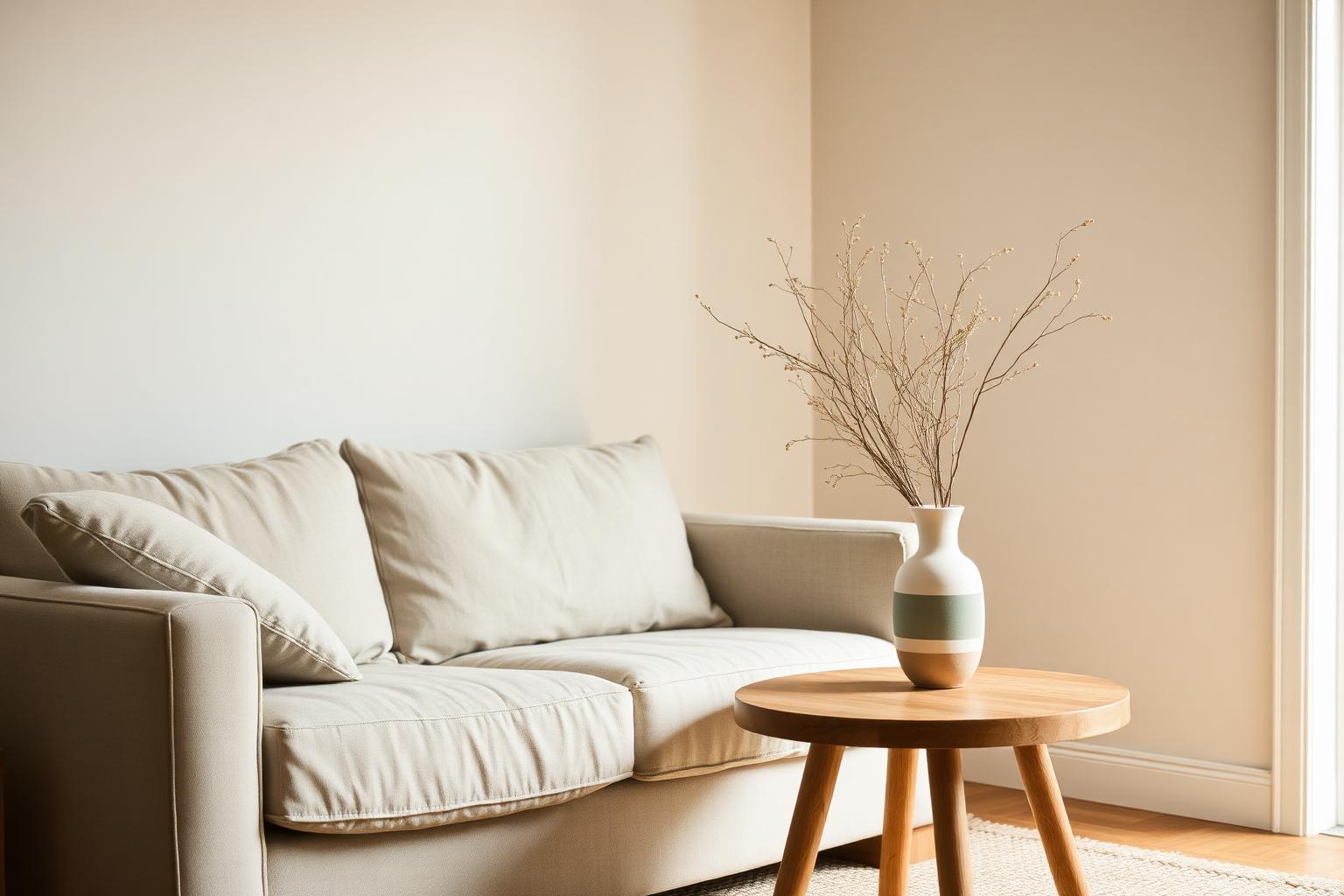
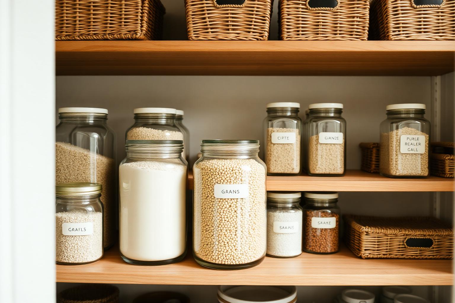
- Foundations (used on walls, large furniture): warm whites, oatmeal, soft taupe, mushroom, putty
- Naturals (used on wood, fabric, and accents): oak, walnut, terracotta, linen, jute, sand
- Accents (used in small doses): one muted color you genuinely love — sage, dusty blue, ochre, burgundy, charcoal
Pick one or two from each bucket and you have your palette. Five colors maximum across the whole home, used in different ratios in different rooms.
Start With What You Cannot Change
Before picking a single paint chip, audit the elements in your home that are not going to change easily: floors, kitchen cabinets, the stone on your fireplace, the trim color, the front door, large built-in furniture. These set the temperature of your palette whether you like it or not.
If your floors are warm honey oak, your palette is going to live in warm-neutral land whether you fight it or work with it. Fighting it (painting walls a cool gray) creates the slightly-off feeling many homeowners cannot diagnose. Working with it (warm whites, soft taupe walls, terracotta accents) creates a calm whole.
Use a Reference Photo
The fastest way to find a palette you actually love is to find five or six photos of rooms you would live in tomorrow. Pin them, save them, whatever — just collect them. Then look at what they have in common. Almost always, the colors share a temperature (warm or cool), a saturation level (almost always muted), and a small set of accent tones that repeat across the photos.
That repeated set is your palette. You did not invent it. You found yours by noticing what your eye keeps choosing.
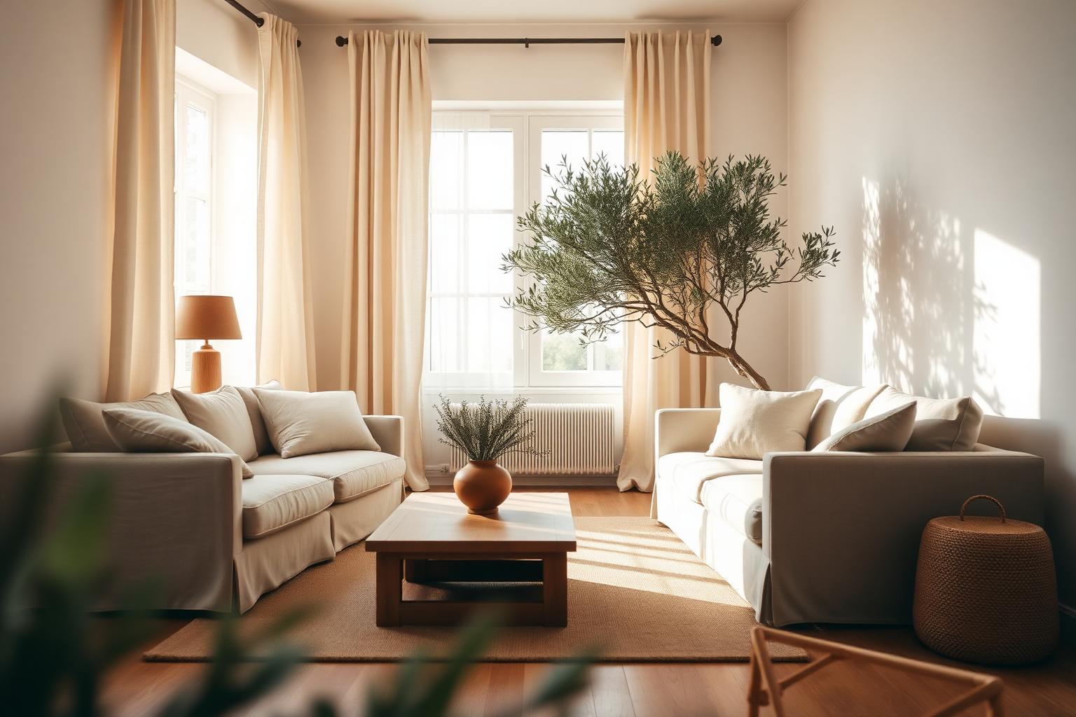
The 60/30/10 Translation
Apply the same 60/30/10 ratio to your whole home that designers apply to a single room. 60 percent of every room is one of your two foundation colors. 30 percent is your naturals. 10 percent is your accent. The ratios stay roughly the same room to room, but which colors fill each slot can shift. The living room might lean foundation-heavy and accent-light. The kitchen might lean natural-heavy. The bedroom might have a stronger accent presence. The palette stays consistent, the recipe varies.
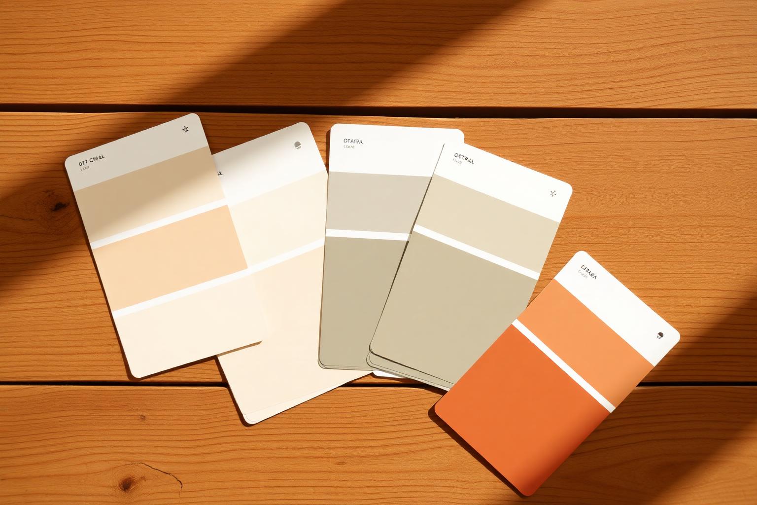
Test in Real Light
Paint colors look completely different in your house than they do on the chip. Bring home four or five large samples, paint them on a board or directly on the wall in two-foot squares, and look at them in morning light, afternoon light, evening lamplight, and overcast weather. Live with the squares for at least three days.
Almost every regrettable paint job is the result of choosing in the store under fluorescent lighting and committing without testing in the actual room. Spend the 20 dollars on samples. Save the 400 dollars on the redo.
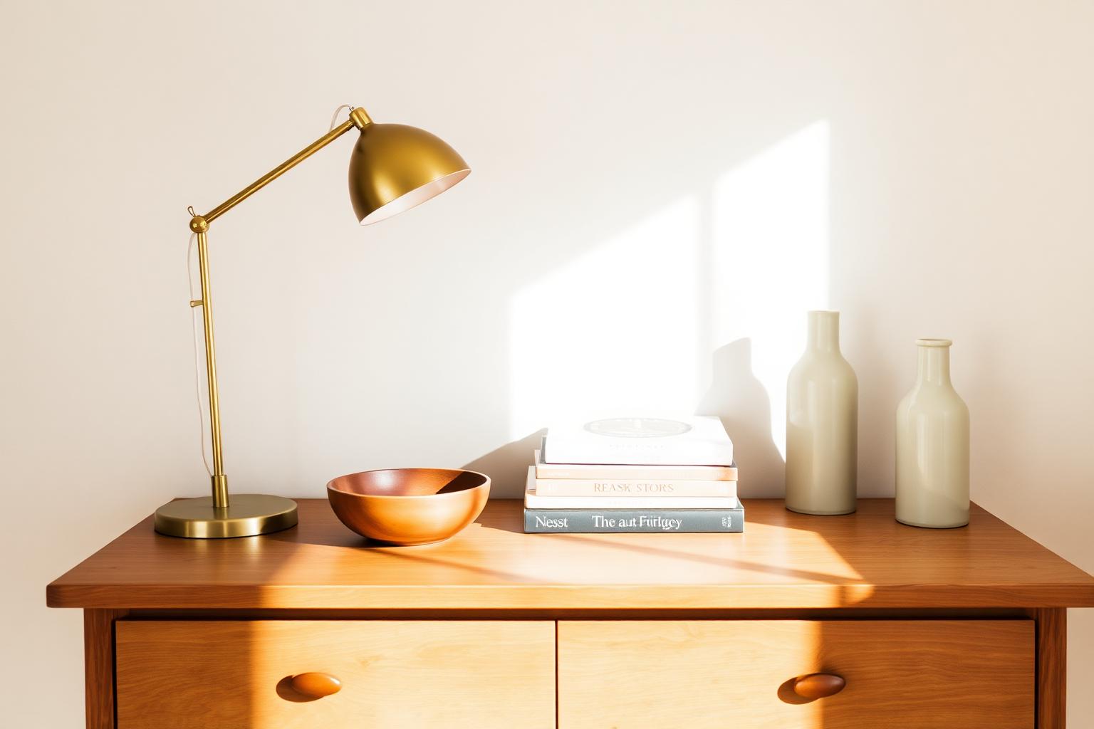
Repeating Colors Tie Rooms Together
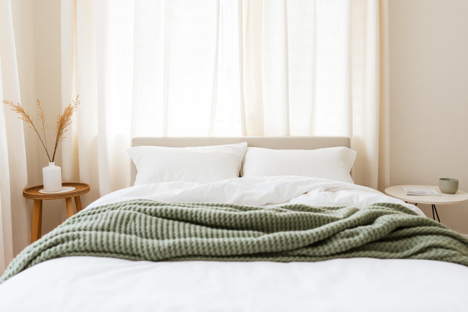
Once you have your palette, intentionally repeat each color in multiple rooms. The terracotta of the living room throw shows up as the kitchen tea towels and the bedroom lampshade. The sage of the bedroom walls shows up as the bathroom plant and the living room vase. Repetition is what makes a home read as a home, not a series of unrelated rooms.
A calm palette is not the absence of color. It is the presence of the same few colors in conversation with each other.
A Note on White
White is not a neutral. White is dozens of colors that all look like white in the store and reveal themselves the moment they are on a wall. Cool whites (Decorator's White, Chantilly Lace) shift blue and feel sharp. Warm whites (White Dove, Swiss Coffee, Alabaster) shift cream and feel softer. Most homes want a warm white. Test, do not assume.
When to Break the Palette
Children's rooms, art studios, powder rooms, and laundry rooms are the safest places to break your palette. They are small, separable, and not connected to the main flow of the house. Go bold there. Save the consistency for the rooms that flow into each other — living, dining, kitchen, hallway, bedroom.
Final Thoughts
A whole-home color palette is one of the highest-leverage decisions you can make as a homeowner. It costs nothing to define and pays back every time you buy a rug, a throw, a piece of art, or a coat of paint. Spend a weekend collecting reference photos, name your five colors, write them down, and tape the list to the inside of a kitchen cabinet. Every future decorating decision becomes a yes-or-no instead of a maybe. The whole house slowly starts to feel like one home.
Filed in Home & DIY · Decor & Styling
More articles